New Home Screen
The home screen app serves as the primary screen the user sees when they open the app.
Up till now, the home screen doesn’t provide a direct and valuable data to the user.
The problem
The home screen doesn’t provide the user a direct and valuable data
The challenge
Create scalable and personalized home screen, based on different types of our users.
Worldwide products availability differences creating various home screen views.
Improve performance preventing loading time increase.
Our goals
Increase user conversion - by creating a home screen that provides users with valuable data at each visit and guiding new users to invest time in providing information to discover meaningful discoveries.
Increase user retention - by providing high user experience and value.

Market research
App store case study - Moving users from MAU to DAU

Other apps with daily personalized content

Personas
The general idea was to capturing and clustering the needs, goals, habits, and attitudes of existing and potential users helps to build a solid understanding of the problem space.
From the New User to Existing User.

User interview questions
Why did you register for MyHeritage in the first place?
Why do you open the app on a daily/weekly basis? What drives you to do so?
Why are you using the mobile app (as opposed to website)?
What information is the most important for you from MyHeritage?
Are you currently taking multiple steps in finding the important info from MyHeritage?
What other mobile apps do you frequently use?
Study results provided information on what are the most valued features for the users and their priority.
Sketching
Mapping the differentiate the needs of these users and the problems our products could solve for them.

Widget list
A high-level list of app features was created to further define and guide the vision for the product.
Prioritizing the features with supporting research created a clear order of execution.

Featured section
The card that appears under the header. It usually shows the most relevant information or call to action for the user.
Cover photo
The photo in the header. User can upload their own photo or leave it as default.
*Endowment effect- You value something more once you feel like you own it in some way.

Research widget
A mini supersearch that lets users do a quick search with a name only.

Genealogy section
A section on the home screen that shows genealogy-related components such as Add people quickly widget and latest discoveries.
Both features give our users an easy way to add more people to the tree.
The more people the users add, the more meaningful discovery they will get.


DNA Section
A section in the home screen that shows DNA related components such as a promo banner, kit tracker or Latest DNA matches.

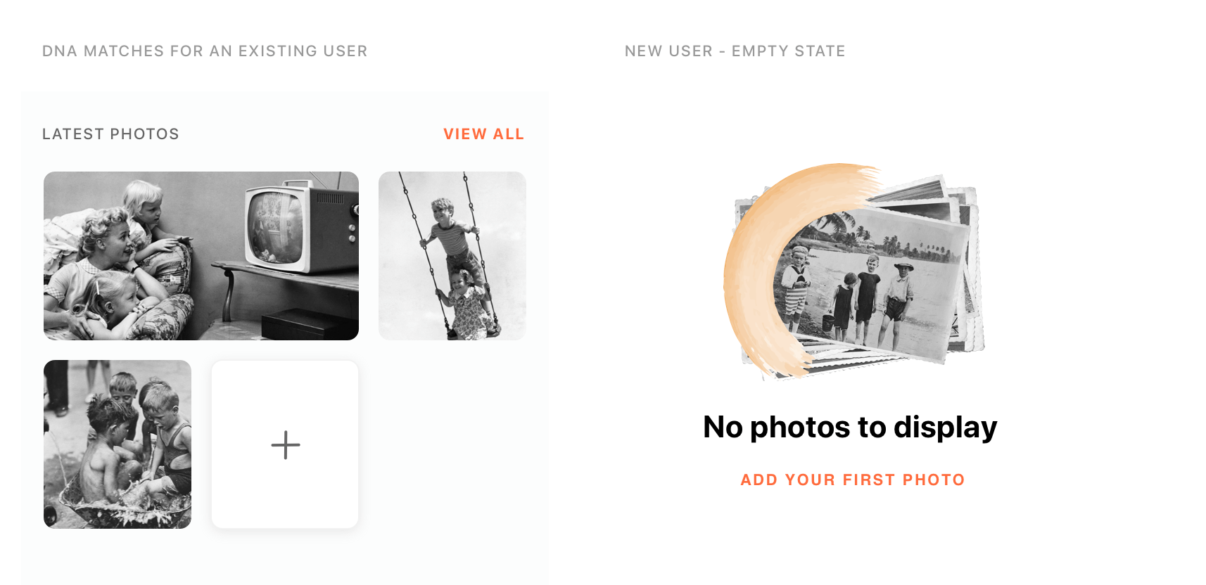
Recent Photos Section
The latest photos that the user added. Offer a quick preview and add a new photo or quick access to the photos page
Family Events
A reminder of anniversary or birthday event of the user family member with an option to sent greeting cards via mail or SMS.

Invite family members
We encourage our users to collaborate with their family members.
The more family members will participate in the app, the more meaningful discoveries the users will get.

Upgrade banner and DNA kit banner


Information architecture

The solution
To avoid the confusion of our users, for the MVP version, we release the variant with 4 important CTA that stay docked on top, and we are currently working on replacing the navigation of the app from side menu to tab bar navigation.
