New brand
language

The problem
Inconsistent design language across MyHeritage products.
Lunching new Health product.
The cost
Lack of cohesiveness weakens the company brand
Inconsistency within the brand hurts the credibility
Confusing product architecture creates poor UX
Developing and supporting multiple design languages wastes Design and R&D resources
The brief
1 / Clear brand architecture
More harmonious, coordinated, cohesive user experience
Easy to feel oriented, within a familiar, comfortable experience
Identical behaviors for all products creates optimal usability
2 / Scalability
The definition of a single, unified brand language, that represents our products and values, and is recognized as the MyHeritage brand.
Clear guidelines, based on a foundation of existing visual tools.
The solution
1 / Align UI/UX in all products with our new design system
Aligning the look + behaviors of ui elements in all products across the interface with new design system components.
2 / Align Health + DNA brand language
Unifying the languages while preserving the products’ individuality
3 / Update the Genealogy brand language
Align to Health + DNA products

Aligning the look & behaviours of elements in all products across the interface

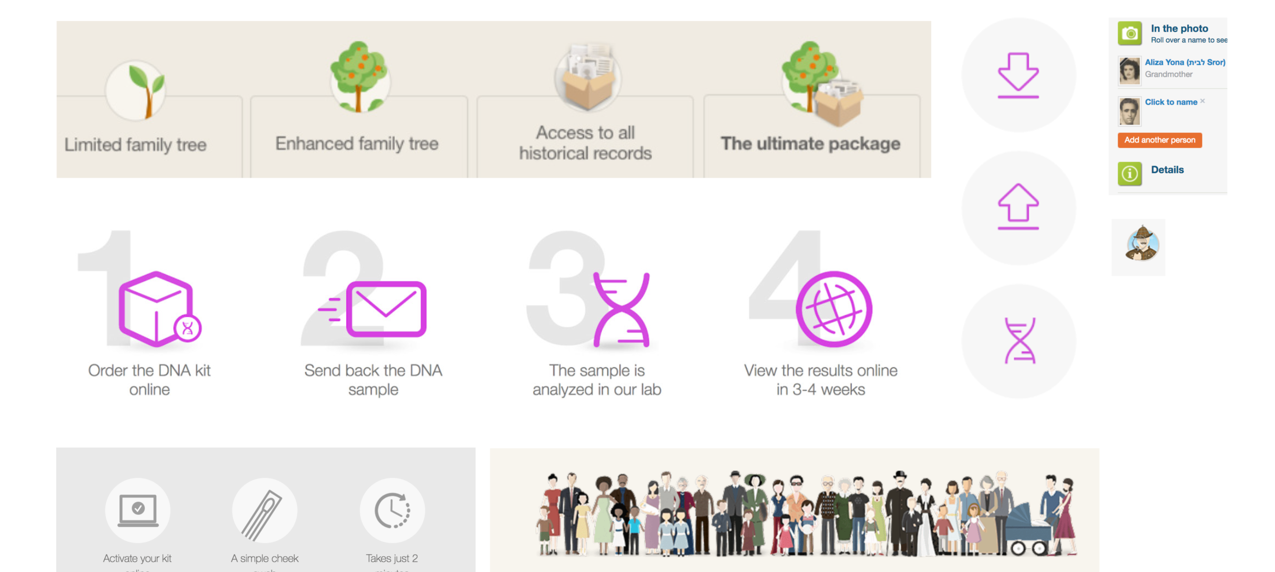
Current flow - Health purchase
UX UI alignment with new design system
The new design system includes a style guide of basic components that provides the consistency of the UI

Left - Health | Right - DNA

Left - the old genealogy UI | Right - New UI design

Search Genealogy feature - Left - Old version | Right - New UI design

All products together after alignment
Marketing perspective
The current multiple and inconsistent languages styles within MyHeritage
Current DNA + Genealogy design language

Current DNA + Health landing pages
The new alignment
In the new Myheritage design language each product represent his own
color + picture + brush and series concept icons


