Knowledge base
Designing Knowledge base: How we built our education center.
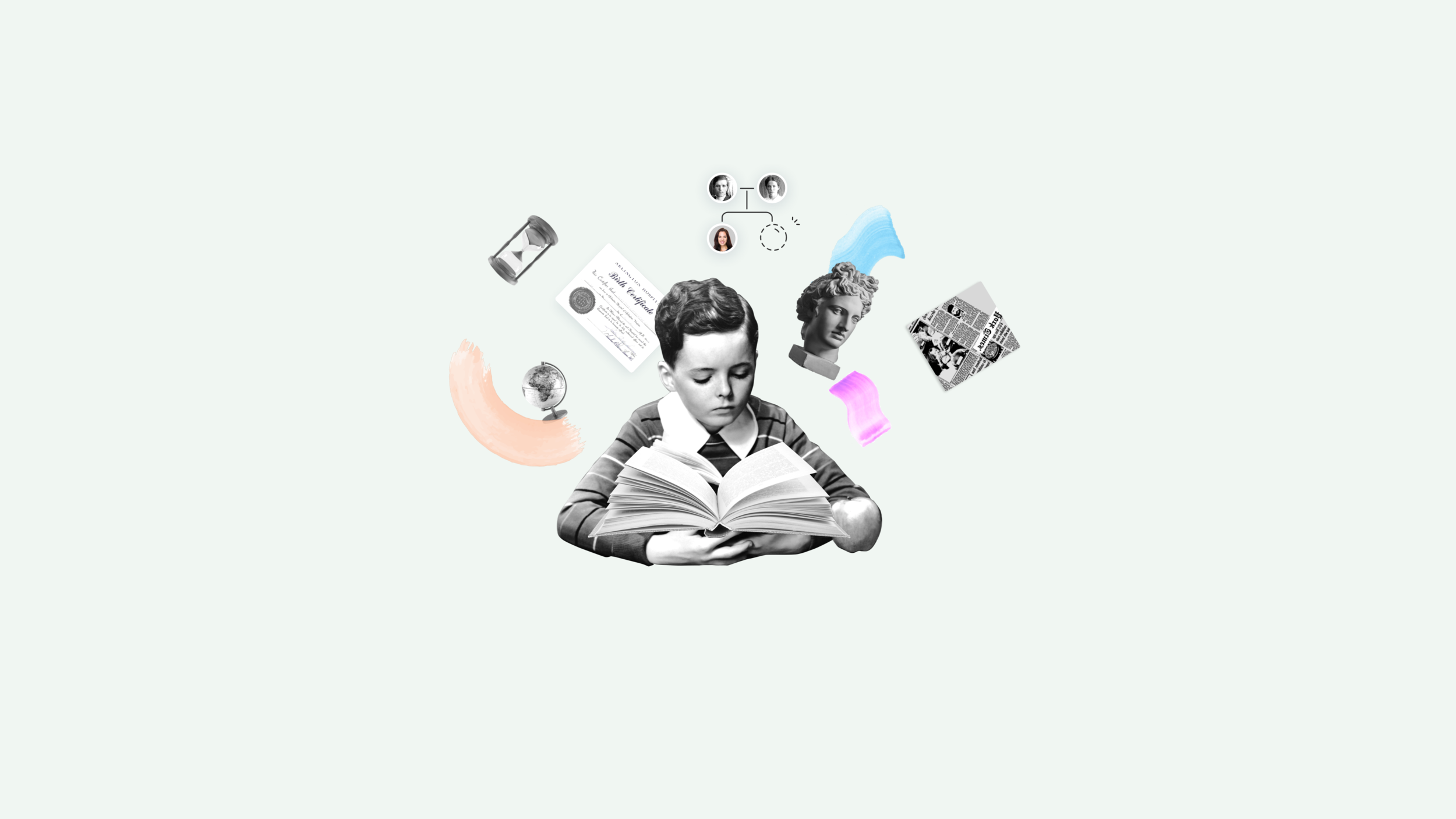
Description
During the MyHeritage LIVE September 2019 conference, we introduced the MyHeritage Knowledge Base, one central platform to allow each and every person to access whatever information they need to deepen their knowledge of genealogy.
This project emerged after noticing that we were relying on multiple external platforms to distribute information, resulting in thousands of tickets from confused users. After several years of letting this practice go by unchecked, we decided it was time to centralize our resources and build a Knowledge Base.
Here’s how we tackled this project:
The problems
There were too many tickets for support by users that didn’t understand how to use the basic features.
There were too many platforms (e.g. Help Center, MyHeritage Blog articles, a how-to video on YouTube, and Legacy website webinars) that were being used to distribute information to our users.
The goals
Making genealogy accessible to everyone, sharing educational resources for people interested in genealogy, and to create an easy and powerful platform that will enrich their knowledge.
Providing a deeper understanding of our platform, features, and capabilities that is relevant to multiple levels of users.
The challenges
Convincing the company to prioritize this project and getting enough resources to complete it.
Covering the 10 different languages MyHeritage supports.
Localizing the content to be culturally and geographically specific.
KPI’S
Main:
500k visitors yearly
Secondary:
% Returning users
% New users
% Bounce rate
1M page views
Average pages per session should be more than 3 pages per session.
Reach top position in Google search results
Research Methods
Mapped tickets in collaboration with the Support team
Analyzed survey feedback from users who churned to find missing features
Defined personas
Mapped the site structure
Collected educational content best practices
Research drill-down: Survey
Surveyed users who churned to understand what was missing.
Their responses showed us that the product was more complicated than we even realized; there was a severe lack of understanding among users about how to use our tools—even ones that were meant to be straightforward.

Personas
Created personas to cover 2 backgrounds:
MyHeritage user (Beginner to Medium)
Non-registered users who are interested in researching their family history

Site map
The keyword for the new structure was “simple.”
Every piece of the new site should be easy to navigate.
From 3 main pages (Home, Learn, and Item pages), users can quickly search for and filter by the topics they need, in the format that they want (e.g. how-to video, article, or webinar).

Best practices
Reviewed educational and blog websites to gather the best ways to present different kinds of content and formats. Paid special attention to layouts, filtering and tagging systems, category structures and how new information is highlighted.

UX
Divided the content into 4 topics that correspond to MyHeritage’s products. The content can appear in 3 different types of formats: articles, how-to video, and webinars.

Search & Filtering
Placed the Search component at the top of the page to give users the option to search for anything they may wish, right from the start.
When the user starts typing, they will see content relevant to their search appear in the dropdown menu, already divided by format type.
The topic tags that appear directly below the search bar also act as starting points, allowing users to quickly narrow down what they’re looking for and find relevant content. The tags act as a visual guide, helping users learn the colors associated with each product throughout MyHeritage.

Content card presentation
Explored 3 different ways to present the content card components: category, format, and name.

Full page desktop + Mobile


Testing
Conducted user-testing on the desktop version, discovering some use cases and needs we hadn’t previously considered:
The search bar disappeared on scroll.
Solution: Dock it in the headerThe user gets lost in the content.
Solution: Add bread crumbsGoing back to search results page can be overwhelming and take the user out of their path.
Solution: Add “Previous” and “Next” buttons in the headerSocial share buttons were lost at the end of the article to readers who didn’t scroll all the way down.
Solution: Move the panel to the left side and make it sticky on scroll
Impact

In terms of support and sales

Testimonials

Upcoming - Our first online course for beginners
